It’s lucky Qantas don’t design planes
I’m glad Qantas don’t design planes because frankly I don’t think they would fly.
Web based flight bookings are money. They’ve changed the way we travel. Why would Australia’s national airline have such a poorly designed user interface for their booking website?
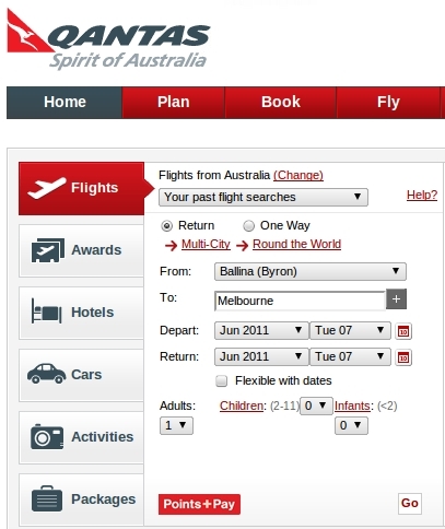
We don’t always read what’s on the buttons at the bottom of forms unless there are two together. I’d love to see click rates of a the dummy buttons below.
Harder to book
I’m guessing someone in marketing thought the best place to advertise their ‘points and pay’ offering was by linking to it from a submit button on the search form. This button is larger and brighter than the button that submits that takes you to your flight search results. It’s simply a link that opens up this page talking about their ‘points and pay’ scheme. Fail.

Just to be clear, clicking the bottom on the left does not submit the form!
Harder to pay
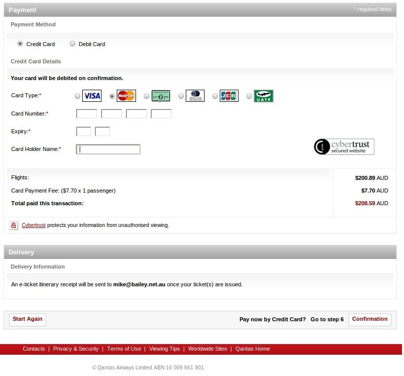
At the end of the booking process they provide a dangerous little button sitting on it’s own that discards your input. Fail. How many people in a hurry click this when meaning to submit the form?
